
🎧 Morning Brief #116 - audio debate on today’s market setup
After five weeks of sustained outflows from US Bitcoin ETFs, the latest weekly candle records a return of positive netflow. At the same time, Bitcoin Supply in Loss reached -46.3% - this is the yellow zone of historical capitulation, while the 90DMA of the indicator has dropped to -18.4%, continuing its downward trend. The two signals indicate that the market is in a zone of maximum selling pressure with the first signs of institutional demand returning.
TL;DR
Supply in Loss has broken through the historically significant capitulation zone (-46%), while ETF netflow has returned to positive territory for the first time in five weeks. The question is whether this is a reversal or a bull trap.
US ETF Netflow (Weekly)
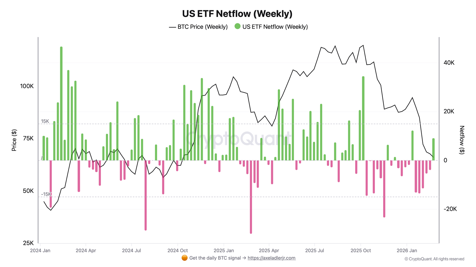
The metric reflects the weekly net capital flow into US spot Bitcoin ETFs.
Over five weeks from late January 2026, netflow remained consistently negative - several weeks in a row netflow dropped below -10K BTC. The latest weekly candle records a green bar with a return to positive territory at +9.1K. This is the first sign change after a series of outflows that coincided with a price correction from highs above $100K to current levels around $66-68K.
One positive bar is a necessary but not sufficient condition for confirming recovery. The key trigger is maintaining positive netflow in the current week. Risk: a return to negative territory amid deteriorating macro conditions would nullify the signal.
Bitcoin Supply in Loss (Weekly)
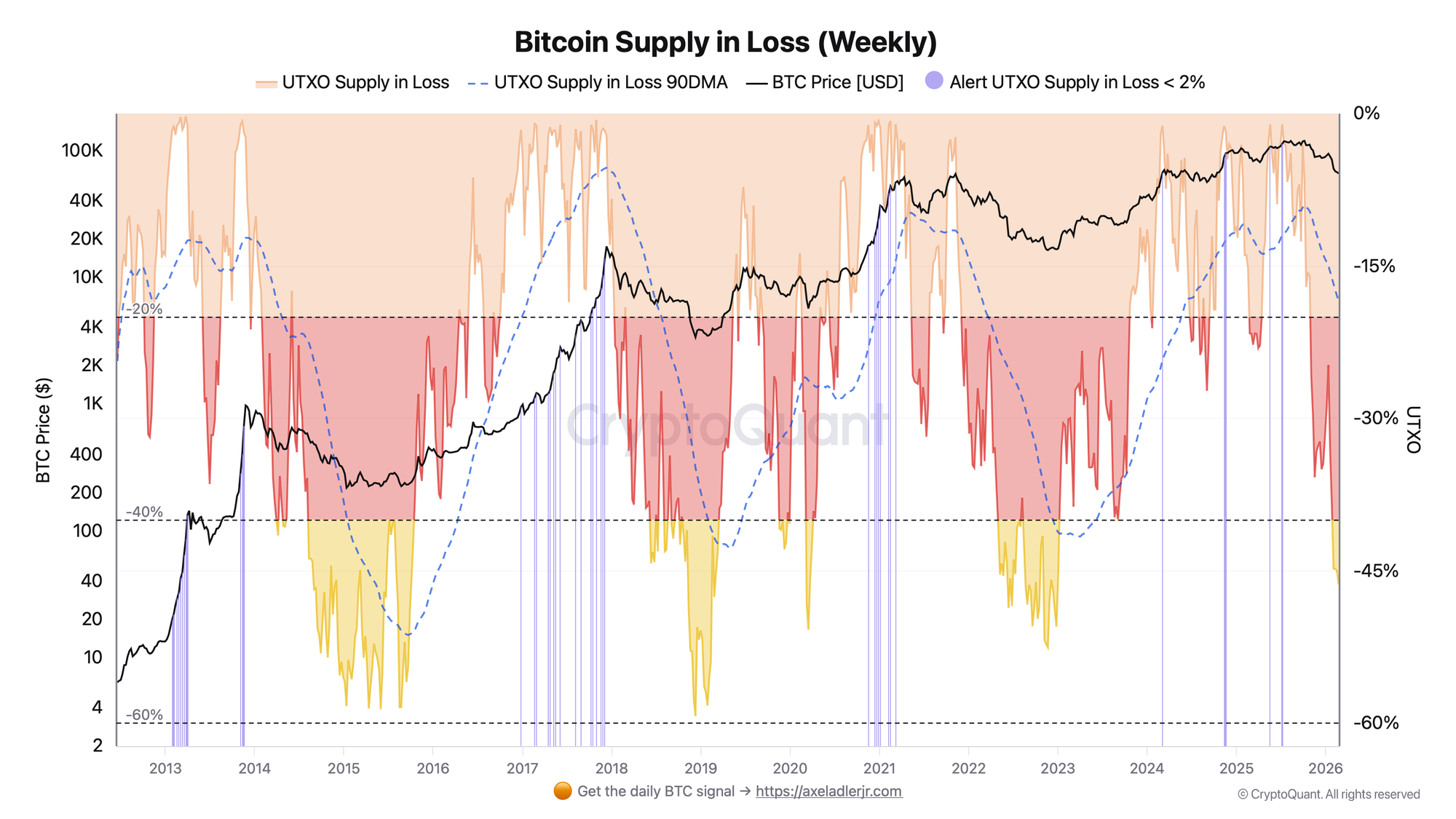
The metric measures the share of Bitcoin supply whose acquisition price is above the current market price.
The current value of Supply in Loss stands at -46.3% as of the latest week - this is the yellow zone on the chart, historically observed during periods of significant market stress (2014-2016, 2019, 2022). Over the past five weeks, the indicator moved from -38.4% (2026-01-26) to -46.3%, accelerating in February: -44.8% - -45.0% - -46.3%. The 90-day moving average stands at -18.4% and continues to decline, reflecting the buildup of pressure over a longer time horizon. Notably, the current episode in terms of depth is already comparable to the capitulation zones of previous cycles, although historical extremes below -60% remain far away.
Being in the yellow zone has historically coincided with the formation of medium-term market bottoms - but not with an immediate reversal. The trigger for improvement: stabilization and a reversal of Supply in Loss back above -40% alongside sustained positive ETF netflow.
The two indicators paint the following picture: Supply in Loss points to a zone of elevated selling pressure and historically observed capitulation, while ETF netflow is sending the first signals of returning buyer demand.
💎 Reading the signal is not enough - you need to act on it. Weekly Engine turns on-chain data into one clear decision per week, with risk caps and invalidation built in. 👉 Start free.
FAQ
Does -46% in Supply in Loss signal capitulation and a market bottom? The yellow zone has historically coincided with periods of base formation, but is not in itself a sufficient condition for a reversal. In previous cycles, the indicator remained in the yellow zone for many months. Confirmation comes from a upward reversal of the metric combined with a recovery in demand.
Under what scenario does the situation worsen? A continued decline in Supply in Loss below -50% alongside a return of ETF netflow to negative territory would signal that institutional demand is unable to absorb selling pressure - historically this indicates a deeper correction ahead.
CONCLUSIONS
Supply in Loss reached -46.3% - the yellow zone of historical capitulation - after five weeks of accelerated decline from -38% to current levels. At the same time, ETF netflow returned to positive territory for the first time in five weeks, forming the first signal of the return of the institutional buyer. The current regime is a phase of capitulation pressure with the first signs of demand recovery: historically this is a zone of high risk and high potential simultaneously. The key trigger for improvement is stabilization of Supply in Loss above -40% and sustained positive ETF netflow for at least two consecutive weeks. The main risk is a deepening of capitulation toward -60% in the absence of structural demand.
Further Reading
If you want to understand the metrics behind today's brief in more depth:
On-chain context: Bitcoin Supply in Profit: Definition, Thresholds & Market Signals - the inverse metric to Supply in Loss, with key threshold levels explained.
Demand & flows: Bitcoin Exchange Netflow: What It Is and How to Use It - the foundational framework behind reading netflow signals, including ETF context.
Broader sentiment: Bitcoin NUPL (Net Unrealized Profit/Loss): What It Is and How to Use It - a related metric that captures the same capitulation dynamic from a different angle.