


🎧 Morning Brief #208 - audio debate
Since mid-May, the stablecoin market has stopped acting as a source of liquidity and started functioning as a drain on it. Both charts show the same shift: fresh fuel capable of supporting Bitcoin's price is no longer flowing into the market.
TL;DR
A brief on how stablecoin inflows - the main fuel of the crypto market - have dried up over the past two months. The logic is simple: without fresh dollar liquidity, BTC rebounds stay short-lived and downside pressure remains in place.
Stablecoins Exchange Inflow 30DMA
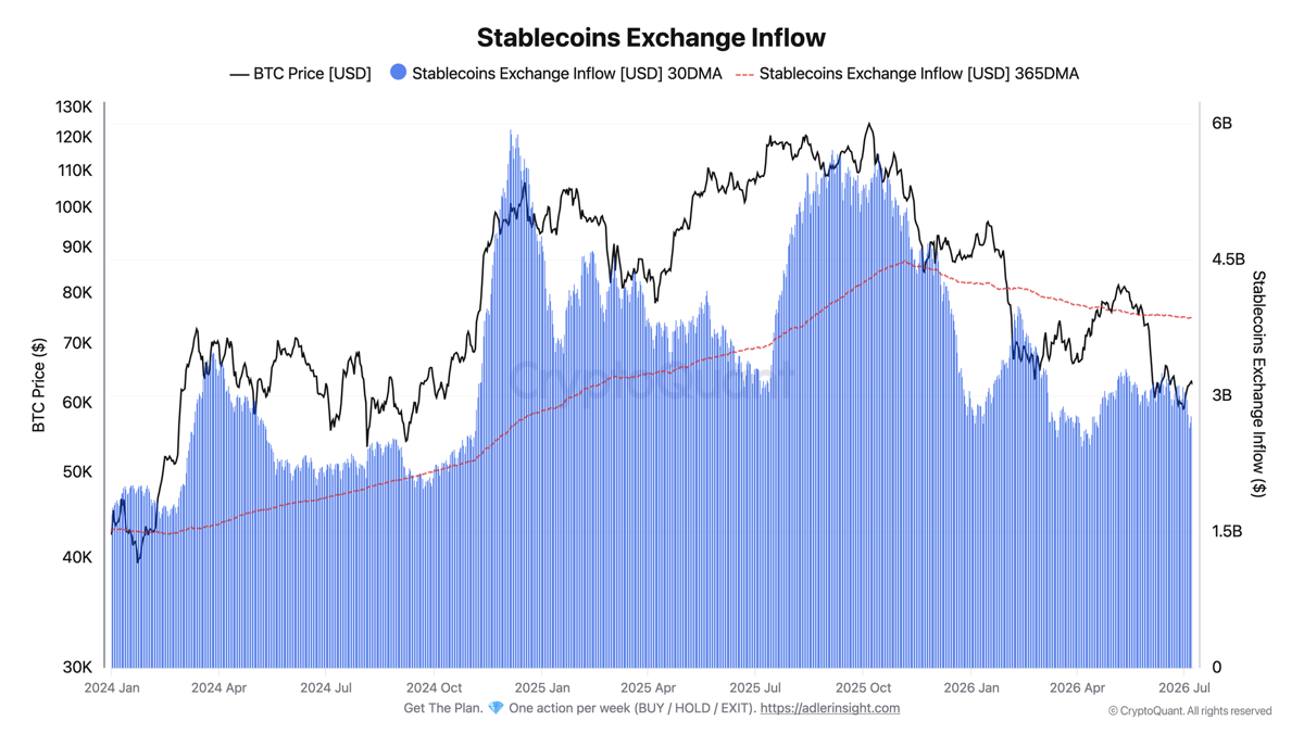
The metric compares the 30-day average of stablecoin inflows to exchanges, meaning liquidity ready to be deployed into purchases, with its yearly average.
Since mid-May, the monthly average has fallen from $3.2 billion to $2.65 billion, or 18%. Throughout this period, the 30DMA has remained below the yearly average, which stands at $3.86 billion. Current inflows are 31% weaker than the normal level. That means exchanges are receiving noticeably fewer fresh stablecoins than they have on average over the past year.
As long as the 30-day average remains below the yearly average, the market does not have enough fuel for a sustained move higher. A sign of improvement would be the monthly average moving back above the yearly line.
30-Day Change in USDT and USDC Market Capitalization
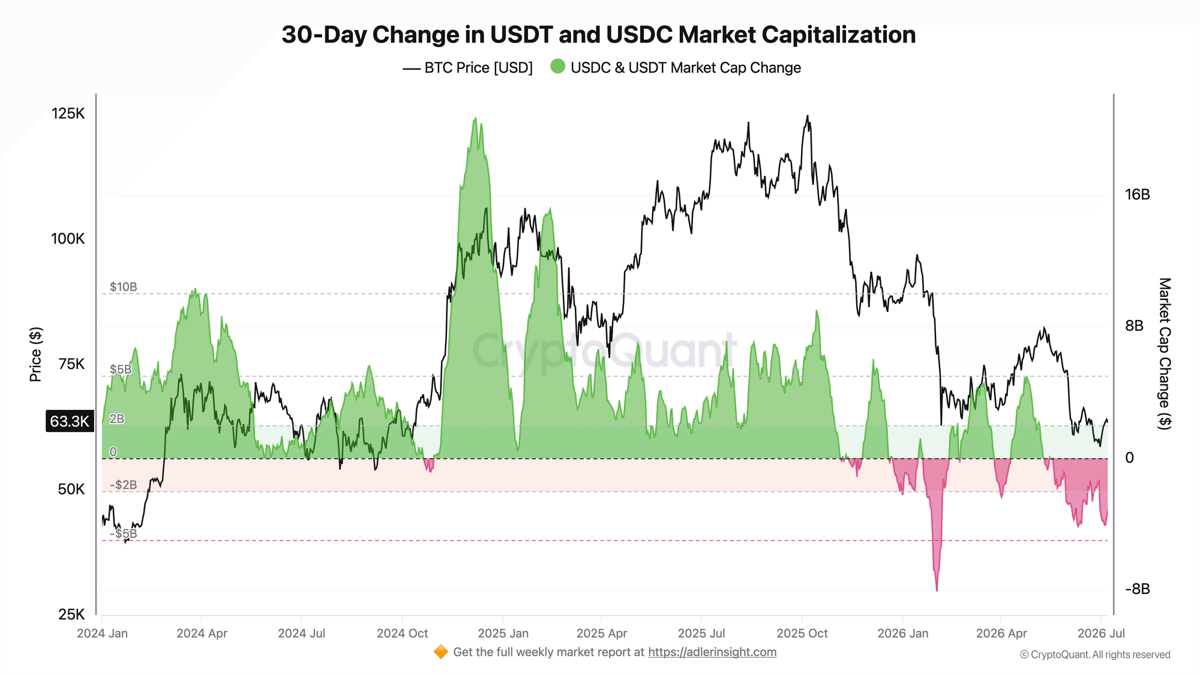
The metric shows the 30-day change in the combined market capitalization of USDT and USDC - whether the crypto market's dollar base is expanding or, on the contrary, contracting.
In mid-May, the monthly change was around zero: the stablecoin base was not growing, but it was not shrinking either. By early June, the indicator had moved deeply into negative territory, reaching roughly -$4.2 billion, and it now sits around -$3.2 billion. That means the combined market capitalization of USDT and USDC is actually shrinking rather than simply being reallocated across assets.
The contraction in market cap confirms that capital is leaving the system, reinforcing a risk-off environment. The small improvement from -$4.2 billion to -$3.2 billion is only the first hint that the outflow may be slowing, but the level itself remains deeply negative.
The second chart reinforces the signal from the first: less fuel is coming onto exchanges, while the dollar base itself is shrinking at the same time. The main point today is that the market is losing liquidity on two levels at once, and Bitcoin's 21% decline since mid-May looks like a direct result of that fuel shortage.
Reading the signal is not enough - you need to act on it. Weekly Engine turns on-chain data into one clear decision per week, with risk caps and invalidation built in. Start free.
FAQ
Why are stablecoins called the market's "fuel"?
Stablecoins are parked dollars ready to buy BTC and altcoins. When both their inflows to exchanges and their combined market capitalization are rising, the market has buying power. When both are shrinking, there is simply not enough support for a sustainable move higher.
What would signal a regime shift?
A reversal in both indicators at the same time: the 30-day average inflow moving back above the yearly average, and the monthly change in market capitalization first returning to zero and then turning positive. Until then, any BTC rebounds should be treated as technical rather than a trend reversal.
CONCLUSIONS
Both charts point in the same direction: since mid-May, the stablecoin market has shifted from being a source of liquidity to being a drain on it. Inflows to exchanges remain 31% below the yearly norm, while the combined market capitalization of USDT and USDC is shrinking by more than $3 billion a month. The main trigger for improvement would be a simultaneous reversal in inflows back above the yearly average and a return in monthly market cap change to zero. The main risk is a renewed acceleration in liquidity contraction, which could push the monthly change back toward -$4 billion and increase pressure on price.
Live Charts
Explore the metrics behind this brief with live, auto-updating charts:
Exchange Netflow - Net BTC moving to and from exchanges across positive and negative flow regimes.
BTC US ETF Flow Monitor - US spot Bitcoin ETF daily flow and the other major source of demand fuel.
Coinbase Premium Index - Coinbase vs global premium as a proxy for US spot demand pressure.
Fear & Greed Index - Composite market sentiment for risk appetite and risk-off extremes.
Liquidity Flows - All exchange-flow, ETF, and spot-demand charts in one view.