
🎧 Morning Brief #193 - audio debate on today’s market setup
The market is going through its second episode of panic selling this year. But realized loss shows an important difference: the current wave is much softer than February’s.
Together, the two charts describe the current regime: capitulation is still underway, but its intensity is fading. This is the second wave of panic, and it looks more like a late stage of the selloff, where pressure remains, but the pool of sellers is gradually being exhausted.
TL;DR
This brief is about the second wave of capitulation and why the fading strength of the selloff matters more than the panic itself. The logic is simple: if the second wave of losses is weaker than the first, it more often points to seller exhaustion.
Bitcoin Daily Realized Profit Loss Ratio
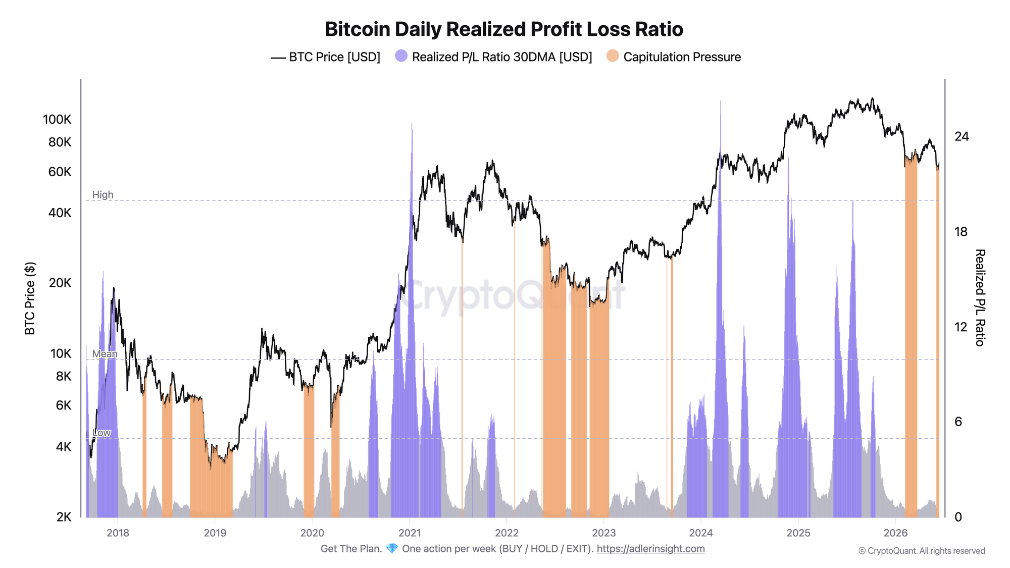
The metric on the right axis is the smoothed 30-day ratio of realized profit to realized loss. The orange zones mark periods of capitulation pressure.
The 30DMA ratio has now fallen to around 0.28 and remains in the Capitulation Pressure zone. This means realized losses have clearly dominated realized profits over the past few weeks.
In practical terms, this is a stress regime where market participants are still selling coins below their purchase price. But the key point is not just the fact that capitulation is happening, but how the market behaves inside it.
Until the Daily Realized Profit Loss Ratio starts turning upward, the regime remains defensive. The first sign of improvement would be the metric leaving the orange zone and holding above recent levels.
Bitcoin Realized Loss
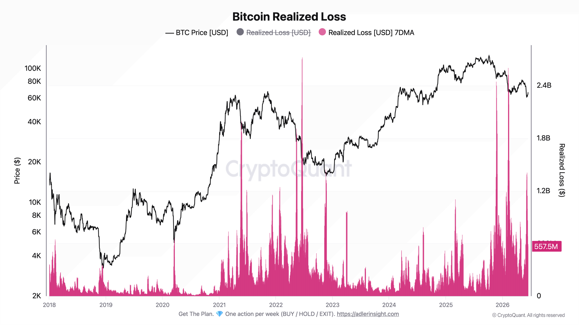
The metric shows realized loss in dollar terms using a 7-day average - how much capital was locked in at a loss when coins were sold below their purchase price.
The chart shows two major spikes in 2026. The February wave pushed realized loss to around $2.6 billion. That was the first capitulation of the year.
The current June wave peaked at around $1.4 billion at the start of the month, almost twice below the February level. Since then, the metric has cooled to around $558 million.
This is an important difference. If the market enters stress again, but the scale of realized losses is already lower, it means there are fewer sellers willing to lock in losses. This kind of behavior is more typical of a late stage selloff than the start of one.
The connection between the two charts is clear: capitulation is confirmed, but its amplitude is fading. Pressure is still there, but each new wave is weaker than the previous one.
The main point today is not the panic itself, but its fading strength.
Outperform Buy & Hold with a rules-based strategy - Start free. One weekly action, clear triggers, and invalidation levels. No guessing.
FAQ
Why can the second wave of selling be less alarming than the first?
Because a smaller realized loss during a repeated capitulation usually points to seller exhaustion. Most weak hands already exited during the first wave, so the new selloff causes less damage in Realized Loss terms.
What would signal a regime shift?
A turn upward in the P/L Ratio 30DMA and a move out of the Capitulation Pressure zone, while 7DMA realized loss continues to decline. That would confirm that selling pressure is being exhausted.
CONCLUSIONS
The two charts add up to a late-capitulation picture. The P/L Ratio at 0.28 still keeps the market in a defensive regime. But Realized Loss shows that the second wave is almost twice as weak as February’s and has already cooled to around $558 million.
The regime is neutral with a constructive tilt. The selloff is not over yet, but its strength is fading. The main upside trigger is a turn upward in the P/L Ratio 30DMA and a move out of the orange zone. The main risk is a new spike in realized loss above the February peak. That would break the seller exhaustion thesis and mean capitulation is gaining strength again.
Live Charts
Explore the metrics behind this brief with live, auto-updating charts:
SOPR - Spent Output Profit Ratio shows whether moved coins realize profit or loss.
STH-SOPR - Short-term holder profit/loss behavior around the 1.0 breakeven threshold.
NUPL - Net unrealized profit/loss across holders, mapped into cycle sentiment phases.
Realized Price - Aggregate on-chain cost basis compared with BTC price and long-term trend.
Fear & Greed Index - Composite market sentiment for risk appetite and sentiment extremes.