
🎧 Morning Brief #181 - audio debate on today’s market setup
The market has entered a phase of strong compression. One-week realized volatility has fallen by more than half over the quarter, while BTC’s market value has been growing more slowly than its realized value for more than six months. The two charts form one picture: low activity on top, compressed market premium underneath.
TL;DR
Bitcoin has become much quieter: volatility has fallen by more than half. But that does not mean the market has “fallen asleep.” Periods like this usually end with a strong move. The main question now is where the accumulated energy breaks: upward, if price returns above the 200-day average, or downward, if the compression turns into a new risk-off move.
Bitcoin Realized Volatility (1-Week)
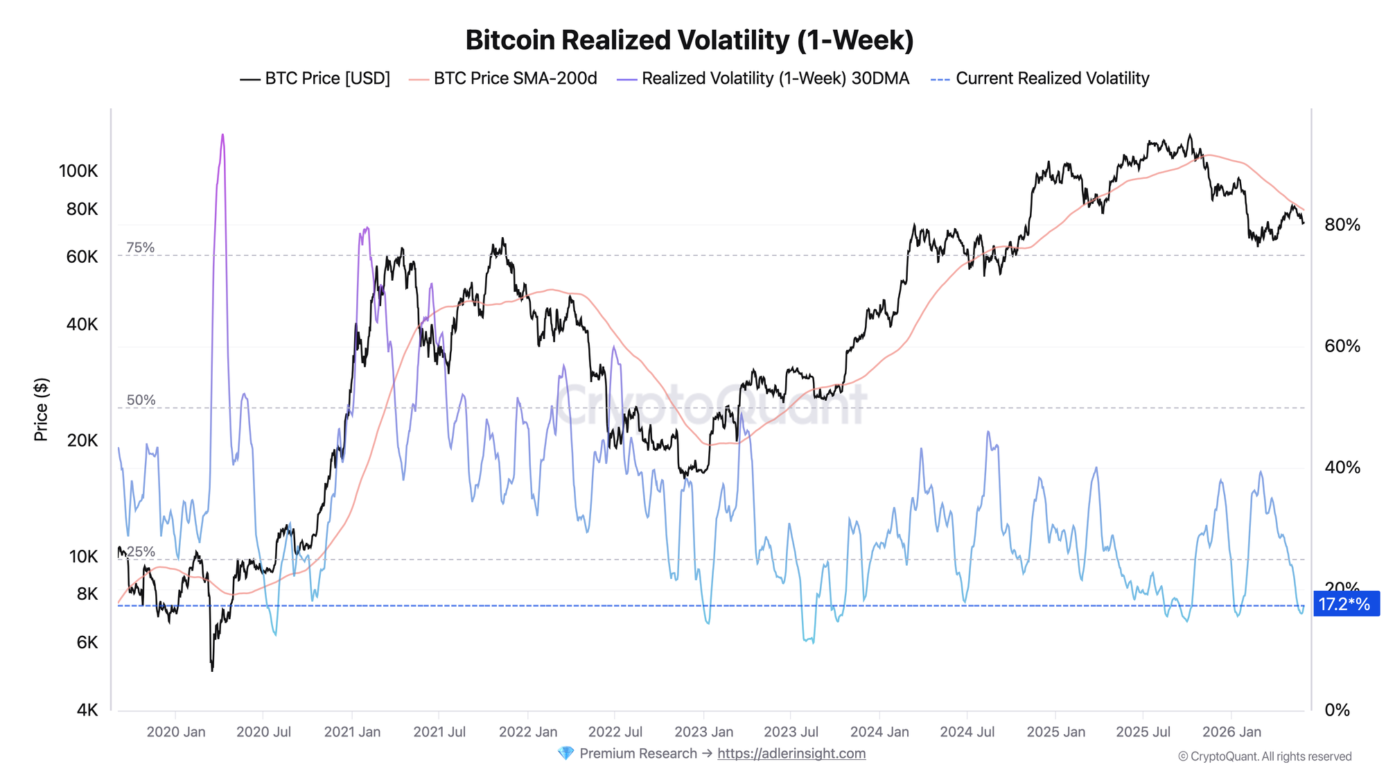
The metric reflects BTC’s one-week realized price volatility, smoothed with a 30-day window.
Over the last quarter, the indicator has fallen from roughly 39 in early March to 17 today, or almost 56%. The quarterly low was recorded in late May around 16. The current value is near one of the lowest levels in the metric’s available history and is noticeably below its historical median. At the same time, price is holding near $73,500, still below the 200-day average around $79,500.
This kind of volatility compression has historically often preceded major directional moves. By itself, it does not give a directional signal. It shows something else: the market has temporarily stopped moving, but energy for the next impulse is building. The trigger for a regime shift will be a sharp expansion in volatility, and what matters more will not be the spike itself, but the side into which it resolves.
Bitcoin Growth Rate (Market Cap vs. Realized Cap)
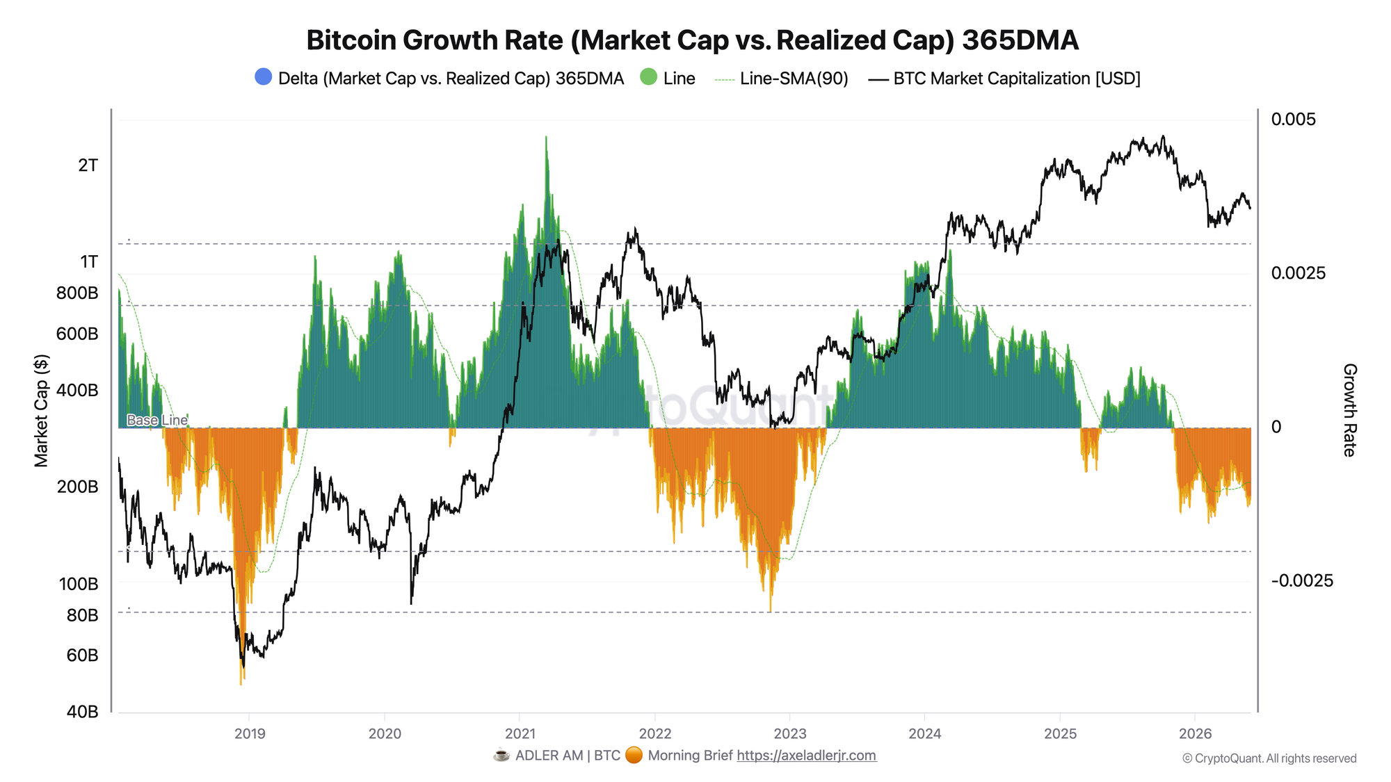
The metric shows the 365-day average difference between the daily growth rates of Market Cap and Realized Cap.
Delta has remained in negative territory for more than six months and deepened in May toward local lows around -0.0013, staying below its own 90-day average. In simple terms: BTC’s market value is not keeping up with the network’s realized value. Price is not confirming the growth of the internal cost basis, so the market is paying a smaller and smaller premium above the capital already locked into the network.
This is a signal of cooling. The market does not look like an aggressive euphoric phase where price sharply runs above the network’s base value. On the contrary, the premium is compressing, expectations are cooling, and buyers are not willing to keep paying more for the same fundamental layer.
A return of Delta back toward zero would confirm a shift in sentiment. It would mean Market Cap is beginning to grow faster than Realized Cap again, and the market premium is recovering. Further Delta deterioration together with downside volatility expansion, on the other hand, would mean a move into a deeper risk-off regime.
The second chart clarifies the first: quiet volatility is accompanied not by overheating, but by cooling. The spring is being loaded from a cooled base, not an euphoric one. That is today’s main observation.
FAQ
Why is low volatility considered an important signal, and not just a quiet period? Volatility compression shows that the market has temporarily stopped choosing a direction. By itself, this is a neutral signal, but the longer and deeper the compression, the higher the probability of a sharp impulse after the range breaks. What matters is not the fact of low volatility, but the following expansion and the direction of that expansion.
What does negative Delta show? It shows that Market Cap is growing more slowly than Realized Cap. In simple terms, price is not accelerating faster than the network’s internal cost basis. That means the market premium is compressing, not expanding.
CONCLUSIONS
Both charts describe the same market from different angles. Realized volatility has compressed by more than 56% over the quarter and is near multi-year lows. At the same time, negative and declining Delta shows that the market premium continues to compress: Market Cap is growing more slowly than Realized Cap, and price is not confirming growth in the network’s internal cost basis.
The final regime remains neutral, but with high potential for a directional move. The main upside trigger is volatility expansion with price returning above the 200-day average and Delta turning back toward zero. That would open the path to risk-on. The main risk is the same compression resolving downward, where a volatility spike coincides with further Delta deterioration and a move into a deeper risk-off regime.
Live Charts
Explore the metrics behind this brief with live, auto-updating charts:
MVRV Ratio — Market value vs realized value to identify valuation regimes and cycle risk.
Realized Price — Aggregate on-chain cost basis compared with BTC price and long-term trend.
NUPL — Net unrealized profit/loss across holders, mapped into cycle sentiment phases.
Fear & Greed Index — Composite market sentiment for risk appetite and sentiment extremes.
Bitcoin Analysis Framework — Multi-layer decision stack for cycle position, participant behavior, and momentum timing.