


Two flow metrics improved in tandem during the second half of August. Net capital flows returned to positive territory for the first time in almost three months, while 30-day apparent demand has exceeded new issuance for six consecutive days. However, the current magnitude of both signals remains historically low. The direction has reversed, but the move remains weak.
TL;DR
After several months of negative momentum, the direction of on-chain flows has changed. Realized Cap is showing net capital inflows again, while apparent demand has moved back above new BTC issuance. However, current readings remain well below the levels seen during previous periods of strong demand. This is early confirmation of a recovery, not a signal of strong capital inflows.
Bitcoin: Realized Cap Relative Net Position Change
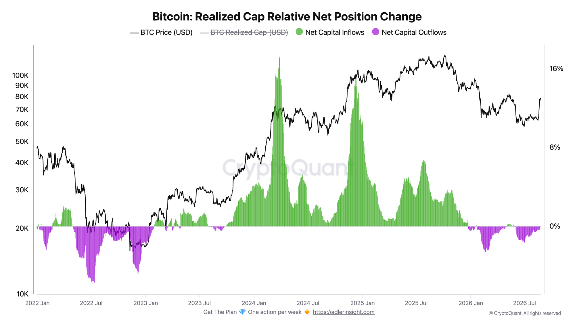
The metric shows the relative 30-day change in Realized Cap. Positive values correspond to net capital inflows, while negative values indicate net outflows.
The metric remained negative for most of the summer. It stood at -0.59% on July 26 and -0.35% on August 19. The outflow then began to shrink rapidly, and on August 24 the metric returned to positive territory at +0.10% for the first time since May 28.
By August 26, the reading had risen to +0.21%. The reversal coincided with Bitcoin's recovery from its August low to $79.1K.
Direction matters more than magnitude here. The current +0.21% remains a very small inflow in historical terms. Among positive readings since the beginning of 2024, the median is +3.24% and the 25th percentile is +1.58%. The current reading ranks within the lowest 3-4% of positive observations during this period.
The move above zero therefore indicates primarily that the net outflow regime has ended. A stronger recovery would require the metric to remain above zero and the inflow to continue expanding.
Bitcoin Apparent Demand-to-Issuance Ratio (30D)
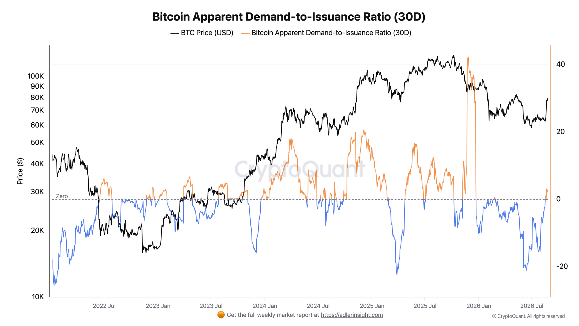
The metric compares the 30-day change in the volume of coins less than one year old with the amount of BTC issued over the same period. A reading above 1 means that the volume of young coins is growing faster than new issuance. A reading between 0 and 1 indicates growth that remains slower than issuance. A reading below 0 means that the volume of young coins is shrinking.
In early August, the metric was deep in negative territory. It stood at -6.93 on August 2. By August 18, it had recovered to +0.81, but briefly slipped back near zero at -0.02 on August 19.
The metric rose to +1.91 on August 20 and has remained above 1 for six consecutive days. It peaked at +3.16 on August 21, while the latest reading is +2.52.
Formally, this means that 30-day apparent demand is currently about 2.5 times higher than new BTC issuance. However, the number looks stronger than it is.
Since the beginning of 2024, the median reading during periods when the metric was above 1 was 7.65, while the 25th percentile was 4.95. The current reading of 2.52 ranks within the lowest 10% of observations above 1.
Demand has therefore recovered from the extremely weak readings seen in early August, but remains low compared with previous periods of sustained supply absorption.
Apparent Demand is not a direct measure of BTC purchases or new capital inflows. It is an on-chain proxy for demand based on changes in the age structure of supply. The main signal is therefore not the absolute reading of 2.52, but the shift from a shrinking young supply to growth that exceeds issuance.
Both charts show the same picture from different angles. Realized Cap has returned to positive territory for the first time in almost three months, while Apparent Demand has recovered above issuance. However, the current magnitude of both signals remains much weaker than during previous strong phases.
Bitcoin's recovery is now receiving its first confirmation from on-chain flows, but the data does not yet indicate the return of substantial capital or demand. The market has changed direction, while the scale of the move remains modest.
Invest in Bitcoin without emotional decisions - Start here. Deterministic signals built to remove fear, FOMO, and panic selling.
FAQ
Why does the reversal matter if current readings remain weak? Moving from negative to positive territory means that the direction of flows has changed. This is the first necessary step toward recovery. A stronger signal will require both metrics to continue expanding.
What would strengthen the current signal? For Realized Cap, the metric must not only remain above zero but also show a larger positive 30-day change. For Apparent Demand, a sustained move well above the current 2.52 would bring the metric closer to levels seen during previous positive phases.
CONCLUSIONS
The direction of on-chain flows changed during the second half of August. Realized Cap Relative Net Position Change returned to positive territory for the first time since late May and rose to +0.21%, while Apparent Demand-to-Issuance has remained above 1 for six days and currently stands at +2.52.
However, the historical context materially changes how these figures should be interpreted. The current Realized Cap inflow remains one of the weakest positive readings in recent years, while Apparent Demand at 2.52 ranks within the lowest 10% of observations above 1 since the beginning of 2024.
The main signal is the change in direction rather than the strength of demand. The market has moved from capital outflows and shrinking apparent demand to a small inflow and positive absorption of issuance.
This is an improvement, but not confirmation of a strong new regime. The next step must be an expansion in magnitude: Realized Cap must remain above zero, while Apparent Demand must move toward levels associated with more sustained periods of demand.
Live Charts
Explore the metrics behind this brief with live, auto-updating charts:
Exchange Netflow - Net BTC moving to and from exchanges across positive and negative flow regimes.
BTC US ETF Flow Monitor - US spot Bitcoin ETF daily flow, BTC-denominated accumulation, and fund leadership.
Coinbase Premium Index - Coinbase vs global market premium as a proxy for US spot demand pressure.
Realized Price - Aggregate on-chain cost basis compared with BTC price and long-term trend.
Liquidity Flows - All exchange-flow, ETF, and spot-demand charts in one view.