
🎧 Morning Brief #203 - audio debate
A comparison between the current correction and the February selloff points not to easing pressure, but to intensifying supply. Coin inflows to exchanges are holding well above the yearly norm, while average SOPR has remained below one. These two charts point to the same conclusion: sellers have become more active, and on average they are exiting at a loss.
TL;DR
The current drawdown looks heavier than February's: exchange inflows have increased, while SOPR below 1.0 shows that the market is realizing losses on average. Until both metrics turn, any recovery remains unconfirmed.
Bitcoin Exchange Inflow
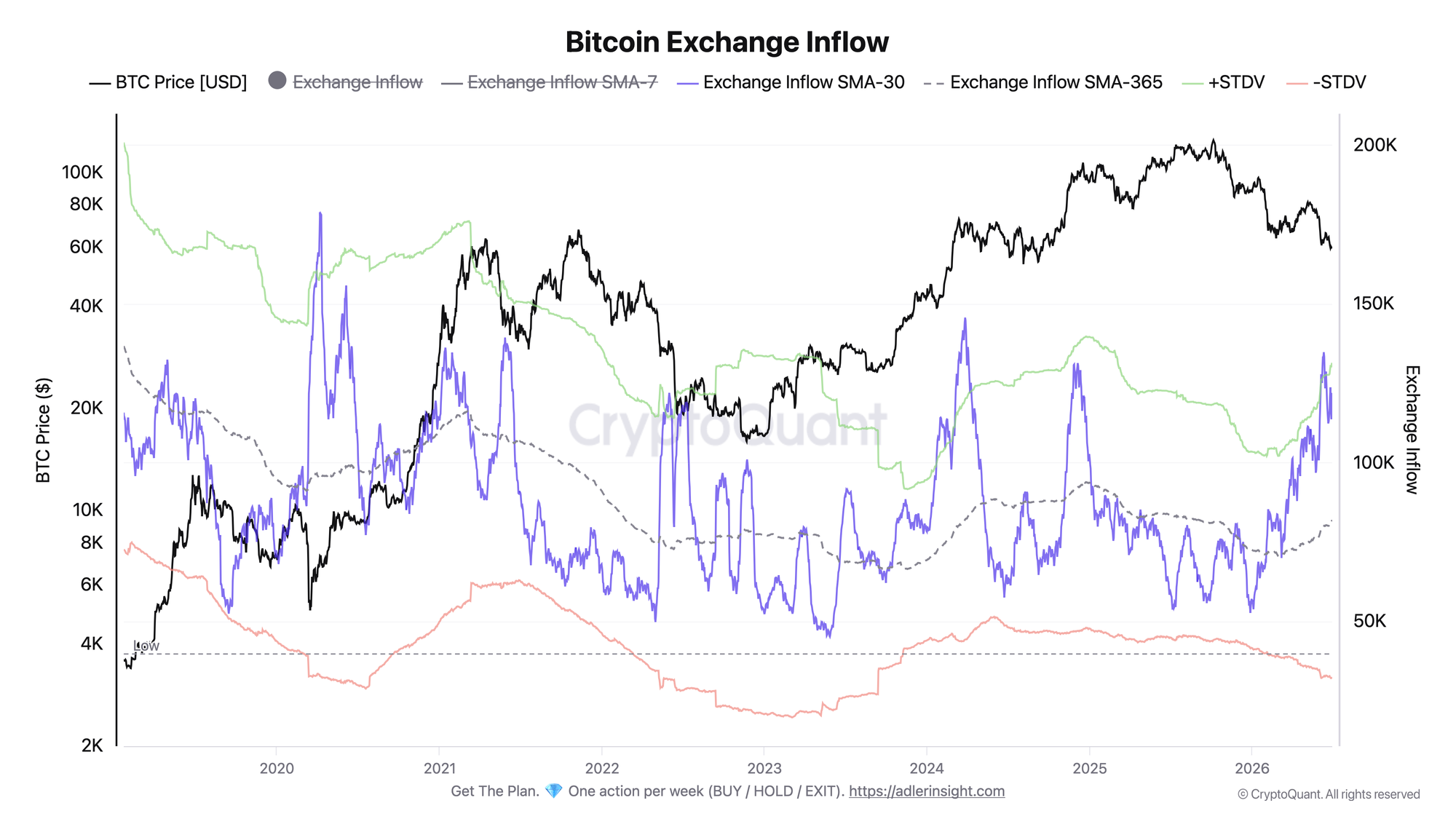
30-day average exchange inflow compared with the yearly baseline (SMA-365) and standard deviation bands.
The SMA-30 for exchange inflows has climbed to 122K and remains well above the yearly baseline, with the SMA-365 sitting near 82K. The metric is also moving up toward the upper +1σ band around 131K. For comparison, during the February selloff the same measure averaged around 80K. That means the current flow of coins into exchanges is roughly one and a half times higher. Over the same period, price fell from the 77-78K area to current levels near 59K. The picture points to a sustained movement of coins toward trading venues.
Inflows that stay consistently above the yearly norm are usually read as a sign of elevated willingness to sell and keep the risk profile tilted to the downside. The improvement trigger would be a move by the SMA-30 back toward the SMA-365 line and away from the upper band. As long as the flow stays near +1σ, supply pressure remains in place.
Bitcoin Spent Output Profit Ratio (SOPR)
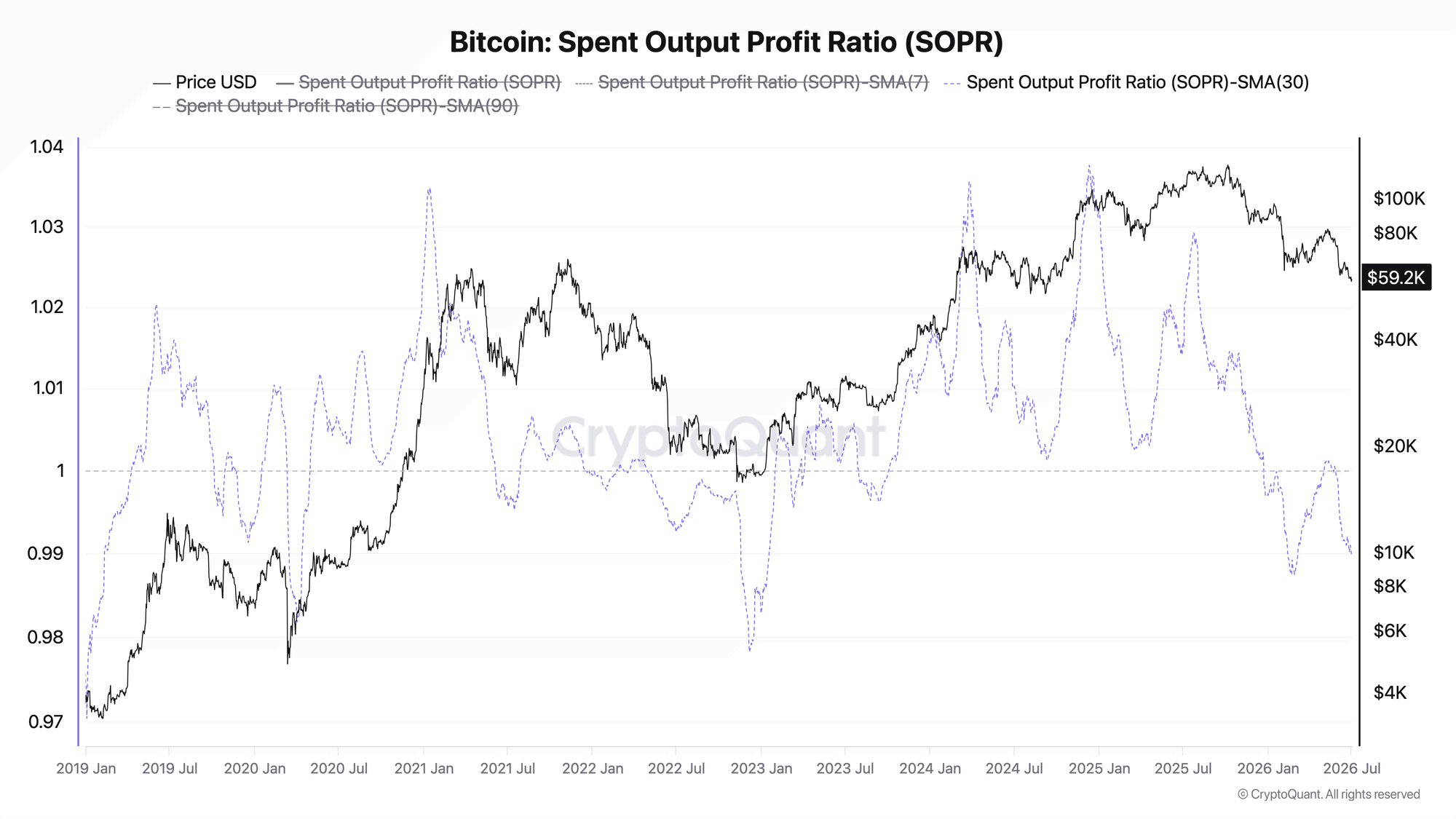
30-day average SOPR. The 1.0 level separates profit-taking from loss realization.
The SMA-30 for SOPR has slipped to 0.99 and remains below the key 1.0 level. From May through July, the metric spent most days below one - 37 out of 61. In February, average SOPR was at the same level, around 0.99. In other words, against the backdrop of heavier exchange inflows, coins are still being spent at a loss on average.
SOPR holding below 1.0 points to an underwater market and weak sentiment.
The link is straightforward: the second chart reinforces the first. In February, the market showed a similar SOPR level, but with much more modest exchange inflows. Now the same loss-taking is paired with a much larger flow of coins toward exchanges. The main takeaway today is that this is not a one-off stress event, but a broader wave of distribution.
Reading the signal is not enough - you need to act on it. Weekly Engine turns on-chain data into one clear decision per week, with risk caps and invalidation built in. Start free.
FAQ
Why does the July picture look worse than February if SOPR is roughly the same?
The level of loss realization is comparable, but current exchange inflows are one and a half times higher than in February and remain near the upper band. The same negative profitability signal is now accompanied by a larger volume of coins ready to be sold.
What would signal a regime shift?
A turn in both metrics at once: a sustained move by SOPR back above 1.0 and a decline in inflows back toward the yearly baseline. Until then, any price bounce remains unconfirmed.
CONCLUSIONS
Both metrics point in the same direction: heavy coin inflows to exchanges above the yearly norm, holding near the upper band, together with SOPR below 1.0, create a combination of selling volume and loss realization that makes the current correction heavier than February's. The regime remains risk-off. The key trigger for improvement is a simultaneous move by SOPR back above 1.0 and a cooling in inflows toward the SMA-365 line. The main risk is that inflows remain near +1σ, extending supply pressure and keeping the market in an underwater mood.
Live Charts
Explore the metrics behind this brief with live, auto-updating charts:
Exchange Netflow - Net BTC moving to and from exchanges across positive and negative flow regimes.
SOPR - Spent Output Profit Ratio shows whether moved coins realize profit or loss.
STH-SOPR - Short-term holder profit/loss behavior around the 1.0 breakeven threshold.
Supply in Loss - Share of supply held at a loss to flag stress and capitulation zones.
Holder Behavior - All holder profitability and supply-cohort charts in one view.